Creating Impactful Reports with KPIs and Data Visualizations
Drowning in data but struggling to glean insights? Many businesses face the daunting task of gleaning actionable KPI metrics insight. It’s not just you; in fact, 72% of businesses acknowledge that they have been unable to make any decisions due to the overwhelming amount of data and their lack of faith in it. However, raw data alone provides little value. Like unrefined oil, it holds potential that must be carefully extracted and presented. This is where game-changing reports shine - synthesizing volumes of data into compelling narratives that inspire action by leveraging SMART KPIs.
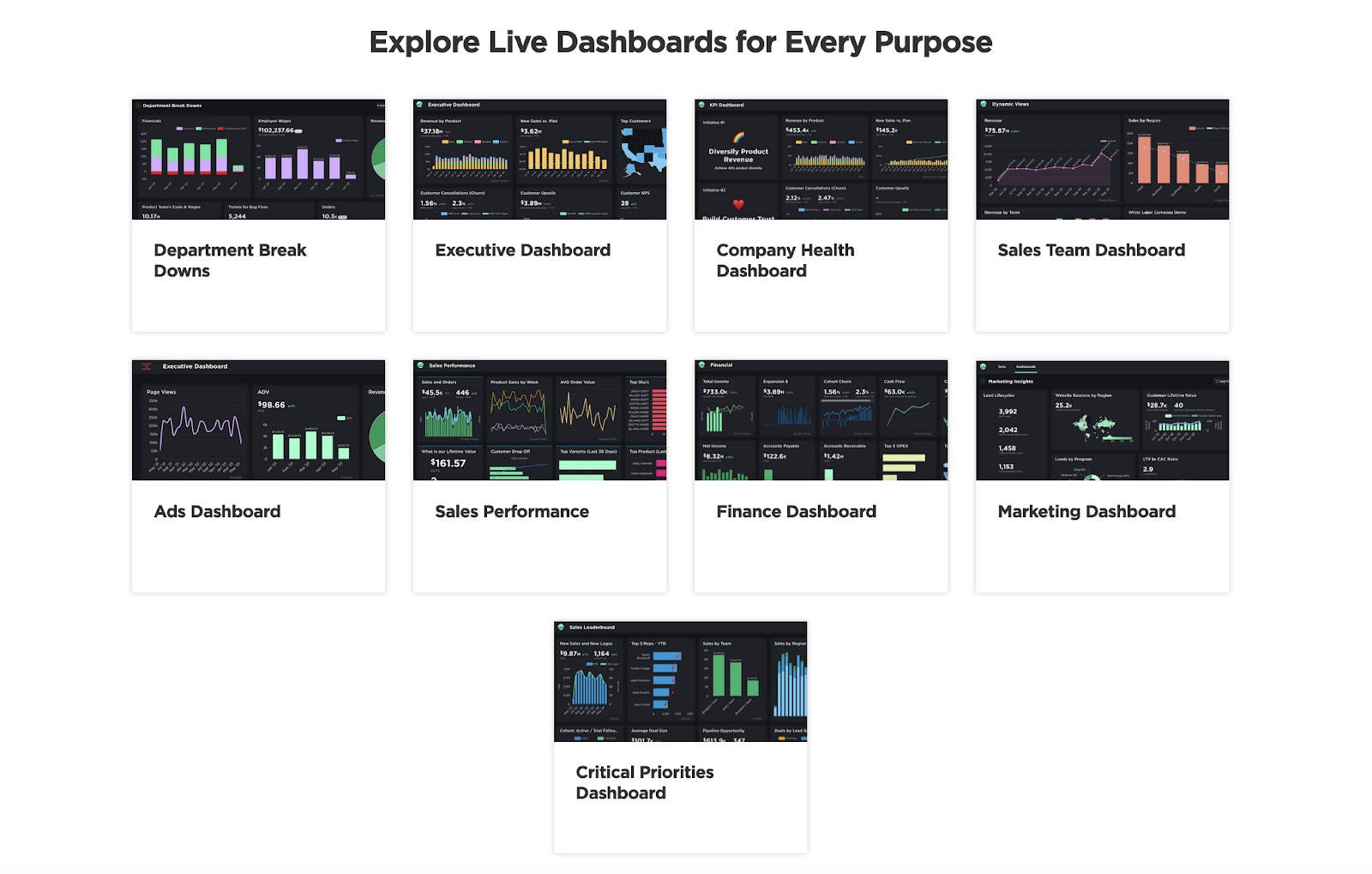
Let's define the KPI dashboard and its synergy with data visualization for clarity.
Understanding the Basics: KPI Dashboards and Data Visualizations
What are the essential components of these insightful reports? Key performance indicators (KPIs) and user-friendly data visualizations. So, let’s see what is KPI dashboard and how these dashboards complement data visualizations to provide a complete understanding.
A KPI dashboard is a management tool visually presenting an organization's or department's most critical KPIs, offering a real-time performance snapshot to facilitate quick, informed decision-making.
In summary, KPI metrics and data visualizations aren't just tools; they act as compasses, helping us navigate the complexities of data and turn them into strategic advantages in the business realm.
In this blog, we'll explore 7 tips for crafting compelling data-driven narratives with KPI dashboard and visualization, transforming numbers into impactful reports that drive strategy.
7 Tips for Crafting Data-Driven Narratives
-
Clearly Define Your Objectives
Before diving into the data, it’s essential to define the ‘why.’ Purpose-driven reporting is about understanding the objective of your report. Why are you making this report - what decisions or actions should it drive? Clarifying the intent focuses analysis. Who will consume the report? Different stakeholders need different insights tailored to their roles.
For example, an e-commerce company tailors executive reports with high-level financial KPIs for top-level insights, while its marketing team relies on detailed reports for campaign optimization.
Clearly defined goals and recipients lead to valuable KPIs and visuals, avoiding data overload.
-
Prioritize Data Quality and Integrity
Harvard Analytics and Data Science study: Just 3% of companies' data meets basic quality standards. A robust report relies on clean, validated data. Prioritize:
-
Data cleansing to fix inconsistencies, errors, and duplicate records.
-
Data validation via statistical methods to verify the accuracy, completeness, and credibility of data.
-
Pipelines for real-time data rather than stale, outdated batches. More current data leads to better insights.
-
Investing in pristine data pays dividends when crafting authoritative, trustworthy reports.
For example, Edit Suits Co., recognizing the critical need for data quality, faced data fragmentation during expansion, but with Grow BI, they efficiently consolidated SMART KPI metrics onto a unified dashboard. This pivotal transformation not only greatly enhanced their decision-making processes but also facilitated operational optimization. This specific case serves as a compelling testament to the merits of investing in pristine data, as it vividly showcases how such an investment can yield authoritative and trustworthy reports.
-
Simplify and Focus
With endless data available, distilling down to what matters most is crucial. Strategies include:
-
Limiting reports to 3-5 crucial KPIs tied to business goals. Sales, customer retention, web traffic, etc.
-
Displaying only essential data points required to provide context for KPIs.
-
Summarizing key findings upfront through an executive summary.
Applying the 80/20 rule when selecting KPI metrics can help avoid diluting insights with unnecessary data.
For instance, Scott Smith is facing the challenge of navigating through a sea of data and a lack of real-time insights into their KPIs. By integrating the Grow KPI dashboard, simplifying their approach towards KPIs aligned with SMART business goals. This strategic shift provided real-time insights and delivered tangible client benefit.
-
Use Effective Data Visualizations
Choosing the right visualization for your data can significantly enhance its impact. Whether it’s a bar chart for categorical data or a line graph for trends over time, match visualization to data for clarity and ease of understanding.
Incorporate interactive functionality such as filtering, segmentation, drill-downs, and tooltips to empower self-directed exploration at the user level. Visual interactivity requires building aggregation logic and hierarchical data structures on the back end.
-
Tell a Story with Your Data or Craft a Compelling Narrative
Data can be challenging to interpret; storytelling guides the audience to key insights. Data visualization platforms like Grow have made this process more efficient by reducing client report creation time. They achieve this by offering templates with preconfigured charts suited for different data types like time series and rankings. These pre-built templates make it easier to present data in visually appealing and insightful data stories.
-
Ensure Accessibility and Usability
In today's mobile-first world, ensuring analytics reports and visualizations are accessible across devices is critical to maximizing impact. Consider these inclusive design best practices:
-
Optimize for mobile and tablets and test on various screen sizes.
-
Prioritize legible fonts, contrast, and concise text.
-
Support text resizing and use alt text for accessibility.
-
Organize content logically with headings and navigation.
-
Enable user customization through data filtering for tailored views.
-
Encourage Feedback and Iteration
Creating effective reports is an iterative process at the core of design. Utilize open channels for feedback. For example, News Corp's successful approach involved step-by-step feedback, helping validate assumptions and save time and resources.
Conclusion
In today's data-driven world, impactful reporting is a competitive advantage. With Smart KPI analysis, compelling visuals, and purposeful narrative, you can transform raw data into authoritative stories that guide business strategy.
However, teams often struggle with time-consuming manual reporting. That's where 'Grow' comes in. Grow, is an easy-to-use Business Intelligence platform that allows anyone to combine data sources, create an interactive KPI dashboard, and generate custom reports tailored to your business needs.
Say goodbye to tedious spreadsheets and the overwhelming nature of data. Explore real-time user reviews on ‘Grow’ via the Grow Reviews Cost & Features on GetApp to gain valuable insights into its capabilities.


Comments
Post a Comment